Why isn’t buying Wii points easier?

April 8, 2009 at 2:46 am (PT) in Rants/Raves, Usability

Downloadable games for the Wii are purchased through credit (“Wii Points”). Wii Points are purchased in the form of gift cards from retailers or are purchased directly through the Wii. The gift cards have a redemption code that must be entered on the Wii. Typing this in without a keyboard seems somewhat laborious. Purchasing points directly through the Wii requires entering a credit card number and some billing information. Typing this in is even more laborious. The gift cards therefore are a bit easier, but they lack instant gratification and seem physically wasteful.

I don’t understand why customers can’t make an account on Nintendo’s website, link their Wii with their web account, and then purchase Wii Points directly through the web. (Potential problems where people mistype their Wii ID number can be prevented by a simple two-step confirmation system.) You’d think Nintendo would want it to be even easier to separate customers from their money.

(Oh, I know I’m being a nitpicky pedant, but when buying points directly on the Wii, the confirmation screen confused me a bit. What am I answering “yes” or “no” to?)

Vilifying Visa

January 18, 2009 at 4:29 am (PT) in Rants/Raves, Usability

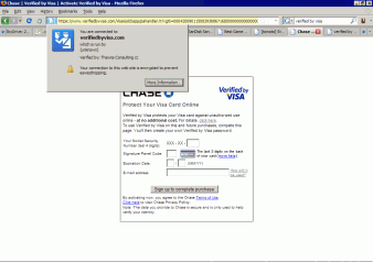
After submitting a credit card purchase at Newegg, I was greeted with a “Verified by Visa” webpage:
Verified by Visa screenshot

This page is idiotic.

  • I was directed to this page without any warning.
  • The page uses the domain verifiedbyvisa.com, not visa.com. A tip to financial institutions trying to thwart phishing scams: pick one domain name and stick with it. People are going to be directed to this page automatically, so the address does not need to be memorable or even human-readable. Using other domain names is confusing and looks suspicious, and if users become accustomed to it, it opens the door for phishers to use their own, look-alike domains (such as, say, verifiedbyvisacard.com, which is available as I write this).
  • For goodness’ sake, register your security certificate properly and completely. “Run by (unknown)” is not reassuring, nor is being verified by “Thawte Consulting”. (I’m sure Thawte Consulting is a big name in the security certificate space, but are they as recognizable as VeriSign? Besides, VeriSign acquired them 10 years ago. Again, pick one name and stick with it.)
  • The page provides me with none of my basic, personal information so that I can have some assurance of whom I’m dealing with. Verification is a two-way street. Continuing to ignore this makes phishing easier.
  • The page outright lies to me. The button says, “Sign up to complete purchase”, but Newegg already emailed me my purchase confirmation. I shouldn’t have to say this, but lying does not build up trust. Duh.

Unsubscribing should be easy

September 20, 2007 at 9:30 pm (PT) in Usability

My mom has been receiving a lot of email from Borders. I don’t know why. Anyway, rather than setting email filters, I generally prefer attempting to unsubscribe from newsletters when they’re clearly backed by legitimate commercial entities (they are, after all, accountable and suable if things go wrong). Setting mail filters takes work, and I prefer stopping the email at the source over letting it clog the tubes.

Unfortunately, unsubscribing from Borders’ mailing lists is a challenge. Each email contains an “Unsubscribe” link at the bottom, but the link takes you to Borders’ website and requires you to log in to set your account’s email preferences. My mom says she has no account—and Borders’ website confirms that no account exists for the email address they’re sending email to—and therefore she can’t unsubscribe.

I eventually resorted to contacting their customer support. They said that they’ve removed her address, but we’ll see.

People running mailing lists should make unsubscribing really easy. There should be no hoops. Users shouldn’t have to remember log-in information. The easier it is for people to escape, the more willing they’ll be to try out the service in the first place. Annoying users who already are annoyed with you has no benefit. This doesn’t apply to just mailing lists. Netflix understands this and gets my business. Earthlink doesn’t, and I’ll never do business with them again, and I tell most people I know my Earthlink story so they will never do business with Earthlink either.

As much as I like ING Direct, the 5% interest rate that some other places offer just seems too enticing over ING’s 4.35% interest rate, so I decided to switch.

I first tried to sign up for a savings account with Emigrant Direct, ING’s traditional competitor. I was very unimpressed with their website:

  • They use “intelligent” form fields that automatically advance to the next field when you fill up the current one. Although they’re not necessarily bad, Emigrant Direct’s implementation is broken. Making a typo in a field and triggering the automatic advancement has an enormous penalty:
    • Backspace doesn’t work in this model. The form fields automatically advance to the next field but have no automatic means to return to the previous field. The standard method for correcting typos consequently is crippled.
    • Shift+Tab is unusable. Not only is there no automatic way to return to the previous field, but the manual way doesn’t work either. Attempting to use Shift+Tab to return to the previous field retriggers automatic advancement, and you’re stranded where you started.

    Worse, since most of the “intelligent” fields are numeric, typos aren’t uncommon.

    Is it so hard to do this right? If you can’t make something smart, keep it stupid and consistent. Being only half-smart is dangerous.

    Also, the need for automatic advancement can be avoided by abandoning their overly structured form design where, for example, they make you enter your telephone number across three separate fields (area code, first three digits, last four digits) instead of using a single freeform field that they validate later.

  • Their session timeouts are too short. Although the online application process is spread over multiple web pages, the form on each page is somewhat lengthy, and they’re full of questions to which I don’t immediately know the answers. Unfortunately, if you spend more than a few minutes figuring out when you last moved or digging up your checkbook, your session times out and all the information that you entered is thrown away and wasted.

If Emigrant Direct wants to make it that troublesome to sign up for an account, it obviously doesn’t want my money, so I went elsewhere. I next tried signing up for Citibank’s e-Savings account. Citibank’s website also suffered from automatically advancing form fields, and at the end of the application process, it offers a confusing procedure to opt out of its mailing lists:

Citibank will periodically send information to you about new products and services … unless you check the box next to your name below. Information about your accounts will continue to be sent to you even if you check the box(es).

Citibank is allowed by law to share with its affiliates any information about its transactions or experiences with you. Please check the box next to your name if you do not want us to share among our affiliates any other information you provide to us….

Financial institutions that want people to trust them with their money should avoid such shady practices that obviously aren’t in the customer’s best interest:

  • It’s an opt-out system rather than an opt-in one. Lack of action grants permission. (“If you want me to eat them for you, please give me no sign.”)
  • Citibank uses negative instructions.
  • Citibank uses inconsistent wording; they use “unless” for one checkbox and use “if you do not” for the other.

I went with Citibank anyway. Sigh.

Stupid registration forms

February 4, 2004 at 1:21 am (PT) in Rants/Raves, Usability

As much as I like PalmSource (the company that makes Palm OS), its registration forms always bug me.

There are always questions that are required but don’t apply to me, such as job title, company name, number of employees, what distribution systems I use, what type of market I’m targeting, and so on. Admittedly, the majority of registrants shouldn’t have any trouble answering these questions. On the other hand, a significant number of Palm OS developers are hobbyists who don’t represent their employers, and these days a lot of people are unemployed.

If your marketing department demands that you require demographic information in your registration forms, remind them that disinformation is worse than no information. If nothing else, provide “not applicable” or “I don’t know” options.

Ok, I’ve run into enough poorly designed “e-commerce” sites to irritate me.

I admit that I know nothing about business, but it seems clear to me that one of the primary goals should be to make it as easy as possible to separate willing customers from their money. If people want to give you money, don’t make them jump through hoops.

For example, an alarming number of sites I’ve visited require me to create an account to buy something. This is a turn-off.

  • For a first-time shopper who might never visit your site again, it’s an extra, unnecessary step.
  • An account implies that the customer’s name, address, telephone number, email address, and credit card number will be stored on file for who knows how long. No thanks.
  • Accounts require passwords. This means that customers either make up new passwords (which they probably will have forgotten, should they ever return), or they re-use passwords they’ve used elsewhere. In other words, that’s either one more password they need to remember or one more place from where someone can steal it.

    I suspect an overwhelming majority of people re-use passwords. As a consequence, most customers must ask themselves: do I trust your site with my password? (It suddenly strikes me as odd that I would trust a site with my credit card number but not my password, but I do.) Even if the answer is yes, that’s one more decision the customer, who has already decided to buy something from you, has to make; that’s one more point where the customer can change his or her mind.

Please, don’t require accounts. Provide them as a convenience to repeat customers, but don’t make them a barrier to first-timers. Make the first-timers happy, build up trust, and they’ll be more likely to come back.

Second, give shipping/handling estimates up front. Make them easy to find. Don’t require the customer to “check-out” first. Ask for the country and the postal code (or city/state) if you must, but do not force the customer to enter a name, street address, email address, or credit card number first. Absolutely do not require that the customer create an account first. The customer is going to find out how much shipping/handling is eventually; why hide it? If you wait until the end, you risk upsetting them and guaranteeing that they’ll hesitate before returning. Tell them at the beginning. Be honest.

(Also, if you do use accounts, it would be reassuring to know if your site hashes or encrypts passwords before storing them.)