I admit that I hate Comic Sans partially as an attempt to be an elitist snob. Being on the bandwagon is amusing. But mostly I hate it because I think it’s an ugly font. It feels strange; it looks too mechanical to be mistaken for handwriting, but it’s not as neat, clean, and formal as a normal typewritten font. It’s in the uncanny valley of typefaces.
In an interview with The Wall Street Journal, its creator, Vincent Connare, said:
If you love it, you don’t know much about typography… if you hate it, you really don’t know much about typography, either, and you should get another hobby.
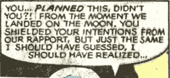
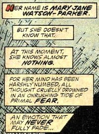
I’m only a wanna-be typographer and typophile, but I think Comic Sans doesn’t offend me as much as a typeface enthusiast as it does as a comic book reader. Connare designed it to mimic comic book lettering, but it doesn’t look like real lettering from comic books. Let’s look at some samples from some prolific comic book letterers:
And now compare to Comic Sans:
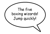
Even Dave Gibbons, the artist whose work from Watchmen partially inspired Comic Sans, calls it “a real mess”. An obvious difference is that normal comic book lettering uses only uppercase characters, making Comic Sans’s lowercase characters feel even more unnatural. Even uppercase Comic Sans doesn’t look much better, however.
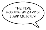
The weight is wrong; comic book lettering traditionally uses a heavier weight for legibility. Comic Sans’s bold variant looks a bit better, although I think it still looks a bit too mechanical.
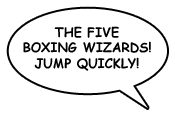
Comic book lettering often is slightly tilted (Tom Orzechowski’s work is a notable exception). I will concede that Comic Sans in all uppercase, bold, italics is not completely horrible. (Blasphemy, I know.)
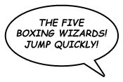
If only that were the default look.

